A century ago, businesses competed for the prime spot on the front page of newspapers. In today’s digital era, the battleground has shifted to securing the top spot in Google search results.
The best weapon for this battle? A well-designed website that caters to what your audience is looking for. But having a website is not just about online visibility: websites give entrepreneurs a powerful tool for lead generation and increased sales.
Website trends are always changing, exploring mobile-first design strategies, the impact of colours and symbols on user understanding, and theories about user behaviour.
But what ties them all together is a commitment to universal design principles and a focus on improving users’ experiences. Harvard Business School newspaper highlights the power of human-centred design in crafting impactful and engaging websites.
This confirms the significance of prioritising the user in gaining a competitive edge and developing products and services that captivate customers.
While securing a reliable partner for UI/UX design services is crucial for business owners, having a foundational understanding of web design basics is always useful, enabling effective collaboration and informed decision-making.
In this article, we’ll discuss 15 principles of web design serving long-term business goals and helping to drive leads and conversions. Let’s go!
Understanding Principles of Web Design
To put it simply, web design is the creative process of organising and showing content on your website, making it accessible to the digital audience. It blends aesthetic and practical features, defining a website’s appearance and including elements like colours, fonts, visuals and user interface and experience.
Today, establishing a website is fundamental for an online presence. Understanding web design principles is necessary if you want to increase website sales, boost online visibility, and draw a larger customer base to your product.
15 Web Design Principles Every Business Needs to Know
1. Relevant and informative content
Imagine a site with only images and no information – visitors would probably be puzzled about its purpose. A successful website should consistently feature informative and relevant content.
Generating top-notch descriptions, articles and posts is a top marketing strategy to captivate your target audience.
Proper content communicates your business’s mission and vision, helping to boost marketing conversion and Google search ranking with the right keywords. When creating a website, put quality content strategy at the top of your list.
2. Visual hierarchy
Even without a background in graphic design, you can still distinguish between good and bad website design. That’s because all humans unconsciously lean towards certain universal visual aesthetics.
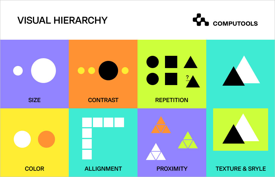
Visual hierarchy in design refers to the way elements are arranged and presented in a composition. It’s a critical aspect of design, helping you organise a webpage by placing elements effectively for the user’s comprehension.
Some key principles to learn about while designing a website are size, contrast, repetition, texture, style, colour and alignment.
3. Responsive design
While it may sound clichéd, having a mobile-friendly website is not just a choice – it’s a necessity. According to Statista, smartphones drive the majority of global digital commerce website visits, accounting for about 74% of retail site traffic in 2023.
They also generate 63% of all online shopping orders. Mobile-friendly sites are getting more appealing to customers by offering easy access and improving interactions. If you want to get more online sales, don’t hesitate to make a website that works on all devices.
Responsive design builds trust with your target customers, showing you can handle changing technology and meet their needs.
4. Typographic elements
Typographic elements play a major role in website design, shaping communicative aspects. Picking the right typography helps create a good-looking, easy-to-read and effective website, impacting how users experience and understand information.
• Font styles convey tone and ensure readability, guiding users through your content and products.
• Proper spacing makes text look nice and avoids a messy appearance.
• Formatting, such as bold and italic, highlights important points, keeping things visually organised.
The wrong font style or size can confuse your website visitors, making them lose interest and check out other options. This could increase bounce rates and lead them to your competitors.
5. Colour choices
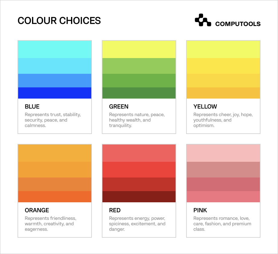
Colour is a powerful tool in website design, attracting users’ attention, driving conversions and conveying specific messages. Thoughtful colour selection impacts how users interpret content, triggering emotional responses and prompting actions.
To grasp how colour affects your products, begin with basic colour theory.
For example, green tones work well for organic and eco-friendly items, while red signifies energy and passion. A good colour scheme should reflect the emotions your brand aims to convey, considering your target audience.
Keep your website looking modern by checking out the latest colour trends. Use colour harmonies by starting with one main colour for a nicer look.
6. Clear calls-to-action
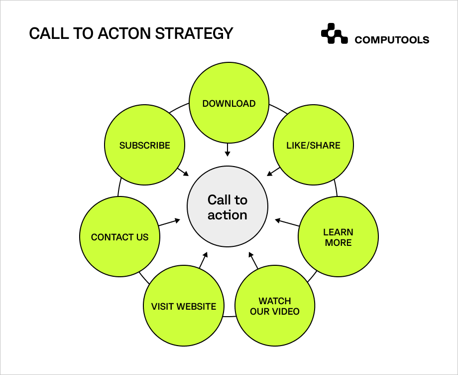
A website’s call-to-action buttons, abbreviated as CTA, provide customers with strong prompts and can take various forms, from banners to visual elements, guiding visitors to immediate action.
CTAs help steer customers to the desired next step on a webpage, such as subscribing or contacting. CTAs vary between websites and you can adjust them according to your needs and industry.
It’s crucial to ensure that CTA buttons and contact forms are clear and encouraging for visitors.
Principles of design for conversion offer simple guidelines, which include:
• Making CTA big and readable so it can be clicked easily
• Using bright and attention-grasping colours
• Keeping CTAs as short as possible
7. Negative space
The importance of white space, also known as negative space, is often overlooked. Some website creators aim to fill every empty spot with information, but that’s not the right way to architect the website.
Negative space is important in website design, and designers include it for several reasons.
White space helps lessen the cognitive load, making it easier for visitors to understand the information on the screen. It breaks down content, making it readable and reducing complexity.
When used properly, it can transform both the design and the business it represents.
8. Fitts’s law
Website design follows various principles outlined by numerous laws, including effective structures, colour choices and element placements.
Among these, Fitts’s law stands out for its focus on enhancing user accessibility. It suggests that making important buttons or links bigger and positioning them closer to each other simplifies user clicks, reducing effort and minimising mistakes.
Adhering to Fitts’s law means an effortlessly navigable website, ensuring a smoother and more user-friendly experience.

9. Website load time
Forbes says that a website taking over 3 seconds to load risks losing up to 40% of potential customers. It’s particularly critical for e-commerce and online shopping.
Website speed also impacts search engine rankings. Google factors it into its algorithm, favouring faster sites.
Some good strategies to improve website speed include compressing images, browser caching, and minimising HTTP requests.
Additionally, you can think about optimising code and upgrading hosting services, as they contribute to a faster website as well.
10. Understanding the target audience
A business website always has its target audience. Marketing experts say that effective marketing strategies revolve around understanding your customers.
To achieve high conversion rates, you should focus on the right groups of people during website design. Your target audience is who you aim to reach and convert into paying customers. Once you identify them, begin planning the website design.
Consider what your audiences desire and expect, to tailor their experience on the site to their needs.
11. Intuitive website navigation
Picture this: a visitor lands on your website and gets drowned in a sea of pages. The result? Frustration, bad feedback, and a high bounce rate.
Navigation refers to how users move around and find the different parts of a website. It involves clicking on links using a web browser to access various pages or sections.
Knowing how to explore a website helps visitors quickly find information with an easy-to-use layout.
Good navigation boosts search engine optimisation, extends visit duration and increases purchase rates.
12. Trust-building elements
To establish trust and drive marketing leads, designers integrate familiar user elements, significantly shaping the overall impression of customers.
Elements like logo placement, search bars, footer links and contact information are widely recognised, fostering a sense of reliability for consumers.
Equally crucial in building trust is a transparent description of your product or service.
Rather than navigating visitors through a complex maze of pages, clearly show the value your business provides, reinforcing clarity.
13. Customer reviews and testimonials
Customer reviews and testimonials serve as social proof and make it more likely for visitors to become customers.
Think about how you check reviews on Airbnb or Amazon before deciding – it’s similar for potential customers. When your website showcases positive reviews, it boosts confidence, encouraging visitors to take action, like making a purchase or engaging with your offerings.
Real reviews from real people can increase sales from your website and improve brand perception.
14. High-quality imagery
To engage more visitors to your website, use high-quality and diverse visuals, like photos, videos, GIFs, diagrams and charts.
These elements serve two important purposes: first, they give visitors breaks between paragraphs, making the content more visually appealing and easier to read; second, they offer additional information to provide a better understanding of the text.
It’s also a great decision to create your own visuals, as they appear authentic and align with your branding guidelines and values more than any stock pictures.
If creating your own visuals isn’t possible at the moment, make sure to use only high-resolution images from photography websites, where you can purchase them at a reasonable price.
15. Simplicity and consistent branding
Consistency is vital for a great user experience. When designing a website, maintain consistency in both design and content.
Visual elements like colour, links and font should remain uniform for all pages. Customers notice these details and become familiar with your site.
Even in small details, consistency helps you build a stronger brand perception. While being consistent, don’t overcomplicate your website.
Remember the universal design rule: KISS, which stands for Keep It Simple Stupid or, a more polite version, Keep It Short and Simple.

Computools
Software Solutions
Computools is an IT consulting and software engineering company that delivers innovative solutions to help businesses unlock tomorrow. Our clients represent a wide range of industries, including retail, logistics, finance, healthcare, and others.
Principles of Web Design in Different Business Sectors
Different businesses have different website needs based on their target audience. Technology companies focus on teens and young adults, while pharmacies cater to older adults.
To stand out, it’s vital to find the right UI/UX design agency with subject matter expertise in your industry. Working with specialists ensures reliable solutions for business growth.
Let’s look at three great websites in different fields and discuss what makes them successful and appealing to customers.
1. E-commerce
Amazon
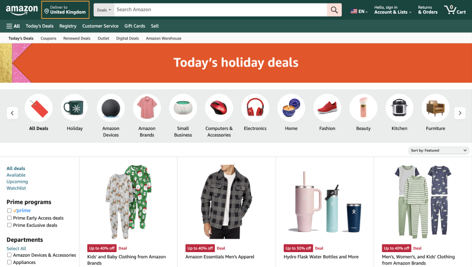
Amazon’s website stands out for its user-friendly interface, efficient search functionality and personalised recommendations.
The platform provides clear and simple product descriptions, integrating customer reviews to build better trust.
One-click purchasing streamlines transactions and membership offers additional benefits. Needless to say, the site has a responsive design and is adapted to different devices.
The site’s success is rooted in its commitment to user experience, convenience and technological advancements, setting the standard for online retail.
2. Technology
Apple
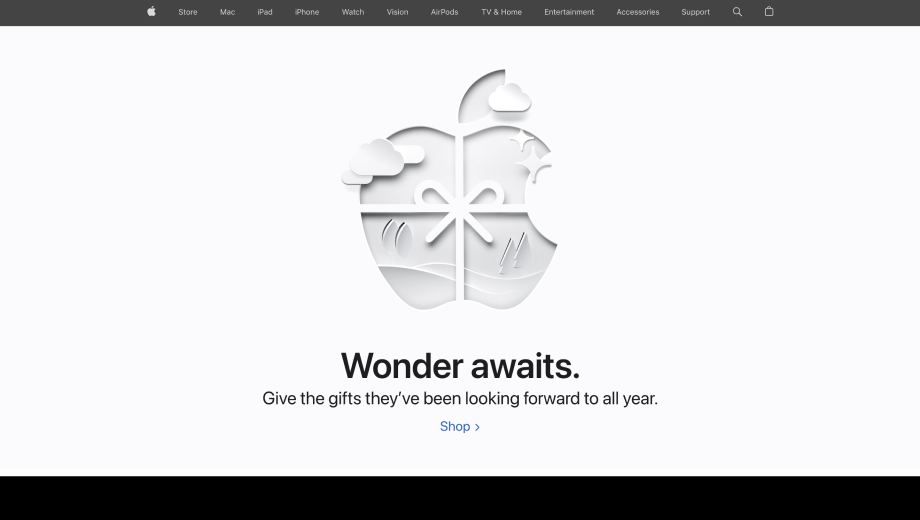
Renowned for its cutting-edge mobile phones, Apple naturally boasts a superbly designed and highly mobile-friendly website. Apple’s products, characterised by classic and minimalistic design, represent a revolutionary inventory of their time.
The same extends to its website. Embracing a simple and product-centric design, Apple’s website distinguishes itself in the market.
Apple opts for a design approach that prioritises the impact of captivating product visuals rather than overwhelming the site with exhaustive details and information.
3. Fashion
Lacoste
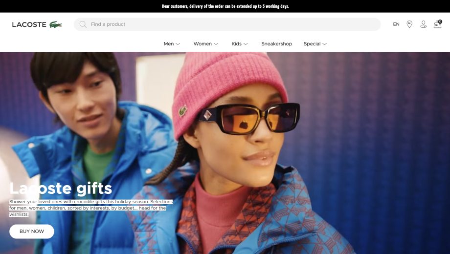
From the moment Lacoste’s business website loads, visitors are captivated by striking imagery that showcases the brand’s popular clothing offerings.
As users scroll down, they see on-brand visuals and compelling links, accompanied by concise text snippets to maintain engagement.
Notably, the website goes beyond directing users solely to product pages. It guides them to explore “About Us” content and other curated materials, enhancing their intent to make a purchase.
From a technical point of view, the platform also ensures a seamless browsing experience and mobile-friendly design.
Conclusion
Undoubtedly, crafting a website independently is no simple feat, requiring time, energy, resources and professional input. Your business website serves as your 24/7 salesperson, shaping the perception of your brand.
As a brand owner, investing in top-notch web development services is crucial for devising effective website design solutions, boosting traffic and enhancing conversions.
Contact us today at info@computools.com for more information on website design and related services.


“Computools was selected through an RFP process. They were shortlisted and selected from between 5 other suppliers. Computools has worked thoroughly and timely to solve all security issues and launch as agreed. Their expertise is impressive.”