THE AUTHOR:

Online landscapes have been changing and becoming more and more notable in recent years, and the trend doesn’t seem to be slowing down. And in fact, is connecting people from different backgrounds in the most diverse ways than ever before.
While the world gets more dependent on technology, modern companies passionately look for ways to secure accessibility across several devices at once to match users needs. Fortunately, UX/UI design services create advanced user experiences and enhance customer loyalty.
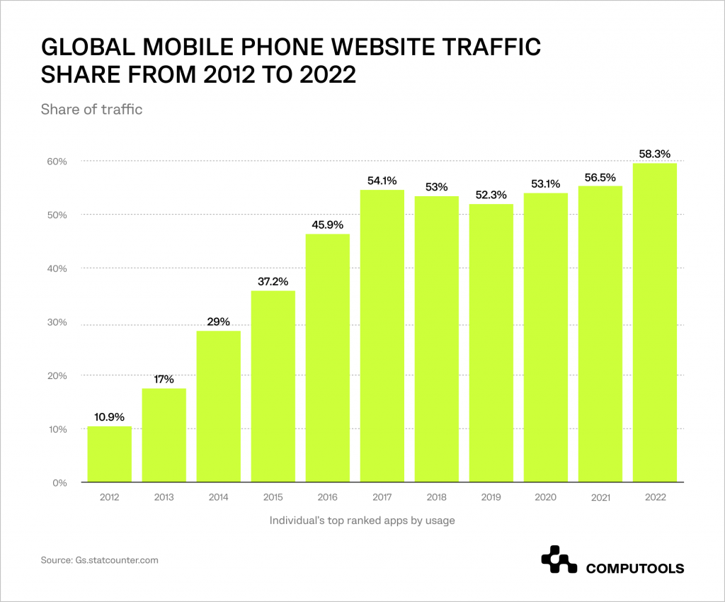
Presently, around two billion individuals use their smartphones to access the Internet, and this number is projected to rise to 72.5% by 2025. As a result, if you don’t design for mobile devices, you are almost guaranteeing a bad user experience. In order to provide you with an in-depth understanding of mobile-first web design, this article will outline the fundamentals of this approach, its necessity, and ways to integrate mobile-first design the best practices into your company’s web pages.
Mobile First Design: What Is It?
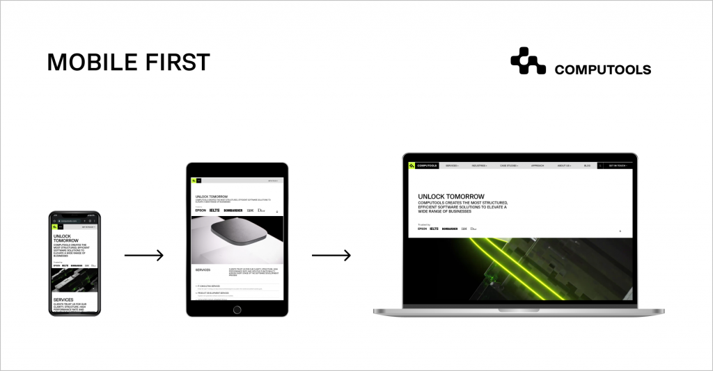
Mobile-first design is an entire design philosophy oriented to secure better user experiences by starting the design process with mobile devices while prioritizing the smallest of screens. Given the limited space of a mobile screen, UX designers are forced to rank a product’s essential aspects, resulting in improved user experience. Understanding the aspects of web & mobile design makes designing for other devices less complicated since the core features and functions have already been identified in the UX’s foundation on smaller screens.
Smaller devices come with restrictions, such as bandwidth, screen size, and multitasking capabilities, making designers focus more on a lean product. As the platform extends to a tablet or PC, designers can leverage the distinctive features offered by these devices. With more real estate on larger devices, designers can broaden the functionality with additional elements and features.
Progressive advancement is the reverse processes, where a designer starts with larger screens and works backward to smaller screens. With this model, a designer starts by including all features and functions and removes them one by one as the sceen being designed gets smaller.
The problem with this approach is that if you build a comprehensive design right from the start, it becomes difficult to differentiate and segregate the primary and supplementary elements from desktop to mobile.
Responsive vs. Adaptive Design: What’s the Difference?
A successful website is one that offers a great user experience (UX) across all screen sizes. To achieve this goal, web designers can utilize both responsive and adaptive design. These design techniques allow designers to create exceptional website experiences for all users, regardless of their device. With top-notch UX/UI design services, you can take advantage of the best front-end user experience for both web and mobile applications.
So, what are the main differences between responsive and adaptive design methods? Let’s take a closer look.
Responsive web design involves creating a website that responds to the user’s device, adjusting the layout and content to fit the screen size. This method uses a fluid grid system and flexible images, allowing the website to adapt to different screen sizes seamlessly. With responsive design, the website’s layout changes dynamically based on the user’s screen size, ensuring optimal viewing and interaction.
Some pros and cons of responsive web design:
(+) Coherent content experiences across all platforms;
(+) Functions well on non-standard screen sizes;
(-) Minimizes control of how the site renders on each device;
(-) Visual hierarchy can be interrupted by the incorrect resizing of elements;
(-) Entails a greater need for cross-platform design proficiency, testing, and modifications;
(-) Slows down site performance.
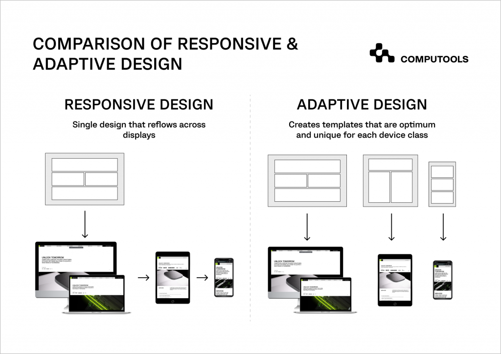
Adaptive we design involves creating multiple versions of a website, each optimized for a specific screen size. This approach uses predefined layouts, each designed for a particular screen size. When a user visits the site, the server detects their device and serves the appropriate version of the website. This method ensures that the user has the best experience possible, as the website is designed specifically for their device. The most common widths are 320, 480, 760, 960, 1200, and 1600 pixels.
Some pros and cons of responsive web design:
(+) Design is optimized for target devices;
(+) Ads and other content can be integrated in more effective ways;
(-) SEO is occasionally affected in a negative way due to inconsistent content across devices.
In conclusion, both responsive and adaptive design are effective methods for creating exceptional website experiences across all screen sizes. While responsive design adapts to the user’s device dynamically, adaptive design provides optimized versions of the website for specific screen sizes. Ultimately, the choice between the two depends on the project’s specific needs and goals.
How Mobile First Design Benefits Business
As mentioned above, mobile Internet use significantly prevails over desktop internet use, so optimal mobile user experience is key for business success. In addition, consumers tend to return to websites or applications with a mobile-friendly interface. Forbes highlights that another competitive edge of mobile-first web design comes from Google’s algorithm that endorses mobile-friendly websites. While search engine optimization is essential for a company’s success, considering the Google algorithm benefits your product discoverability. That’s why most companies have found significant value in designing for mobile devices first.
Another important reason for mobile-first design is that companies spend much more advertising their products via smartphones than TV. Social media-sponsored advertisements with adorable animations have become the most common way to reach new consumers. It’s clear without saying that there’s a need for mobile-friendly websites.
Mobile-First Design: Tips for Creating a Great Website or Web Application
1. Create a comprehensive list of everything that you want your site to have;
2. Prioritize your content and understand where you want it to be present on your site;
3. Design from the smallest to the largest screens;
4. Make sure the tappable areas are bigger to connect better with fingertips;
5. Avoid complex graphical images;
6. Choose a comfortable font and size for important text and use space to help with readability;
7. Consider cooperating with expert IT professionals to create screens and designs that fully fit your needs.
The Importance of Prioritizing Content in Mobile-First Design
When designing with a mobile-first mindset, it’s crucial to prioritize content. Due to the limited screen space on mobile devices compared to desktop monitors, designers must strategically place content to ensure it’s easily accessible to users. Since mobile users lack a mouse or keyboard, it’s essential to make the content easily browsable.
For example, incorporating folding tabs or menus can maximize space and make content more readily available to mobile users. Additionally, clear calls-to-action and proper menu selection can help facilitate navigation on mobile sites.
Nowadays, mobile-first design solutions have become a critical component of a successful online presence for businesses. Adopting this approach allows companies to improve user experience, increase customer engagement, and generate higher revenue. By prioritizing content in mobile-first design, businesses can create exceptional mobile experiences that meet their users’ needs and achieve their goals.
Contact Computools’s experts now at info@computools.com to learn more about our mobile-first web design services to take your online presence to the next level!
Computools
Software Solutions
Computools is an IT consulting and software development company that delivers innovative solutions to help businesses unlock tomorrow.


